
The Context

Timeline
Oct 2024 - Oct 2025

Platform
Responsive website
%201.svg)
My role
Web Designer & Developer

Project overview
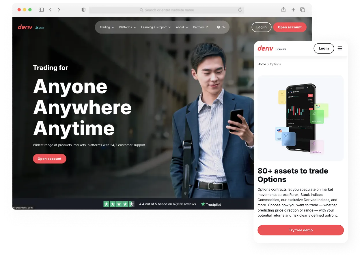
Deriv.com is the main website for Deriv, a global online trading company that serves millions of users worldwide. The site acts as the central hub for clients to learn about the brand, explore its platforms, and get started with trading. My work involved helping maintain and enhance the website’s design, structure, and user experience to keep it consistent, accessible, and aligned with Deriv’s growing digital ecosystem.
%201.svg)
Team members
- Product manager
- 4 Web Designers
- 4 Webflow Builders
- 2 Content Writers
- 2 SEO Specialists
- 1 Translator
- 2 Quality Engineers
The Challenge
From High-Code to Low-Code
As a world-leading online broker serving millions of users, Deriv.com’s web presence must be both robust and incredibly agile. The core challenge was that its massive scale consist of an enterprise ecosystem of over 6,000 pages localized in 18 languages and was being held back by its rigid, high-code platform.
This created a critical bottleneck. Nearly every update, from launching new features to fixing minor bugs or making urgent content edits for compliance, required developer intervention. This friction not only slowed the company's ability to react to market changes but also severely limited the design team's ability to maintain a consistent brand experience across the site.
To break this bottleneck, a strategic initiative was launched: migrate the entire enterprise website to Webflow. Spearheaded by a design-led team, the primary goal was to democratize website management. By rebuilding the site's architecture from the ground up, we aimed to empower designers and the content team to create, update, and deploy pages independently, ensuring brand consistency and allowing the company to finally move at the speed of the market.

The Problems & Solutions
Bridging the Experience Gaps
“What does this trading term mean?”
“How do I know what Deriv’s been up to?”
“I feel lost trying to find the right info.”
While the migration to Webflow aimed to improve internal workflows, our UX analysis revealed deeper issues affecting how users experienced the website.
Through usability reviews and stakeholder discussions, several key pain points surfaced. New users struggled to understand trading terminology, while returning visitors found it difficult to stay updated with the company’s latest initiatives. Others often felt lost navigating through layers of content to find the right information or understand how to get started as partners.
As part of the UX design team, I focused on translating these insights into tangible, user-centered improvements within Webflow. While learning the platform, I designed and developed modular, CMS-driven pages that solved real user problems from making information easier to find to creating spaces that communicated trust and transparency. This hands-on process not only strengthened my UX foundation but also deepened my ability to bridge design strategy with no-code implementation at scale.
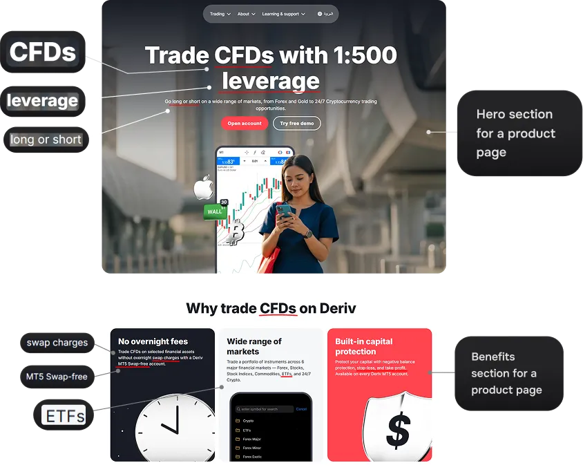
1. “What does this trading term mean?”
Many new users struggled to understand the trading terms used throughout the website, which made it difficult for them to grasp Deriv’s products and services. This lack of clarity often led to confusion and hesitation when exploring the platform.

Trading terms
How do industry leaders approach this?
We looked beyond Deriv and found that the best ones make complex terms simple and accessible. They use glossaries and clear language to guide users without overwhelming them. Inspired by these practices, we aimed to create a glossary experience on Deriv.com that feels intuitive and educational.
Binance
Bybit
Shaping the solution
To address users’ confusion with trading terminology, we designed a dedicated Glossary page that explains complex terms in simple, human language. Each definition is concise, scannable, and supported by clear categorization for easy browsing.
The Design
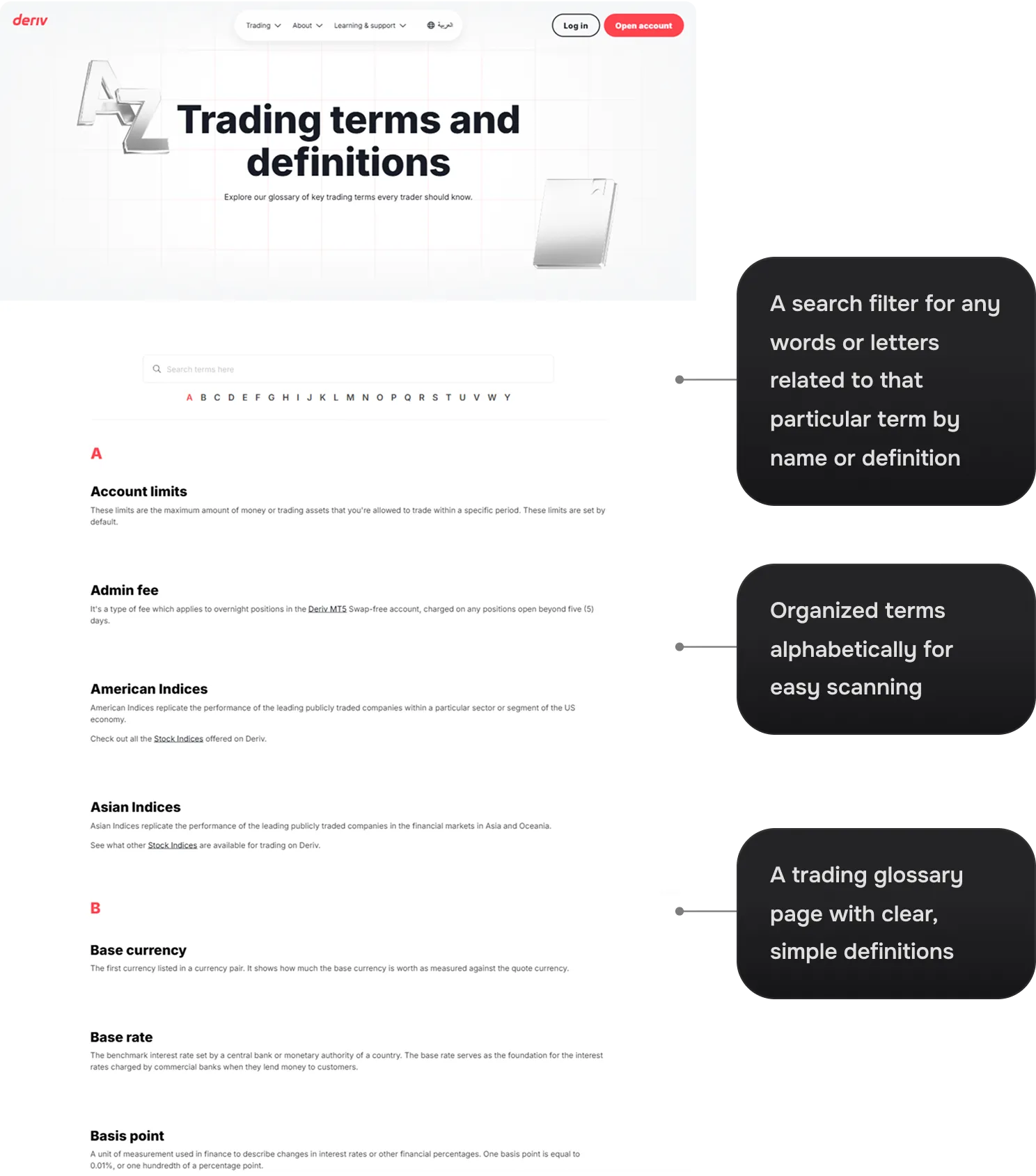

“Familiarity matters, the A–Z structure is very common in online glossaries or dictionaries. This helps reduced cognitive load for the users.”
Bringing It to Life in Webflow
Production Build
2. “How do I know what Deriv’s been up to?”
Previously, users had no single source of truth for company updates. Information about Deriv’s latest activities, events, or media coverage was fragmented, leading to confusion and low engagement. This caused some users to feel disconnected from the brand, unsure if Deriv was active or evolving.
No company updates


“When users can’t easily see company updates, it creates a perception of low transparency, which directly impacts their trust in the platform and reduces their confidence in continuing to use it.”
How Others Solve the Transparency Gap
Most top platforms prioritise transparency by making product updates highly visible, accessible, and easy to understand. They have a dedicated “Media Center” page that highlights all the press releases by the company as well as any mention of their company in the news. This page also acts as a single source of truth which helps users feel informed, builds trust, reduce uncertainty and strengthen user confidence in the platform’s reliability and progress.
eToro
Exness
From Insight to Solution
Guided by user insight and industry patterns, we created a Newsroom page for Deriv that brings all company updates into a single, discoverable experience in order to solve the transparency gap and build user trust. For better user experience, we organised the page into two distinct sections to make it easier to navigate and differentiate the type of updates.
The Design
.webp)

“Predictability enhances usability. Using standard 'filter and search' patterns mimics familiar news sites. This reduces cognitive load because users already know how to interact with the page without being taught.”
Live Implementation on Webflow
Production Build
3. “I feel lost trying to find the right info.”
The initial Help Centre for Deriv has a lot of text-heavy cards with full sentences ("How do I calculate...") rather than concise keywords, making it harder for the user to scan and find information quickly. This causes the user to suffer from cognitive overload which makes finding specific answers feel like searching for a needle in a haystack.
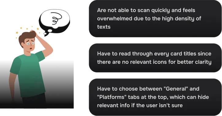
Overwhelming texts
.webp)
How Leading Platforms Provide Information Clarity
Most top platforms prioritise clarity by transforming their Help Centres into a centralised knowledge hub that is highly visual and easy to navigate. By using distinctive iconography and intent-based navigation, they allow for rapid scanning and instant discovery of answers. This streamlined approach ensures that information is not only accessible but also easy to digest at a glance.
Slack
Reimagining the Help Centre Experience
Inspired by industry best practices, we redesigned the Deriv Help Centre to prioritize instant findability and user autonomy. By implementing a clean, icon-driven layout and a more logical information hierarchy, the new experience eliminates visual clutter and guides users directly to the answers they need.
The Design
.webp)

“Recognition over Recall. Pairing clear labels with distinctive iconography so users can simply scan the visual anchors to recognize the relevant category, significantly speeding up the navigation process."
Executing the Vision via Webflow
Production Build
The Impact
How the New Experience Resonated
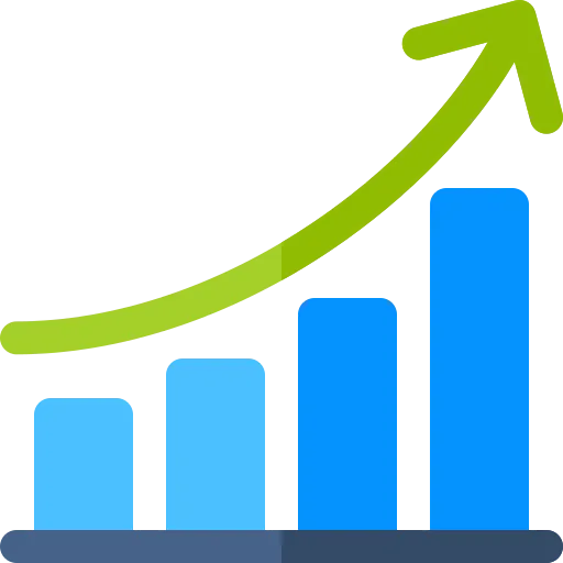
We received positive feedback and saw a significant upward trend in both traffic and conversion rates which directly reflects a more efficient user journey. These improved metrics validate that the UX refinements didn't just polish the look but also successfully removed the barriers to entry and drove tangible growth.

3× faster page launches
Reduced webpage shipping time from 2-3 weeks to 2-3 days
30% boost in sign-up rate
Optimized user flows and enhanced usability

23% increase in CTA click interaction
Refined interactions and layouts to increase engagement with key elements
The Takeaways
Clarity Over Complexity
The core takeaway from this redesign is that user-centricity and business goals are not at odds, they are deeply interconnected. By simplifying the interface and building a high-performance production site, I learned that even the most data-heavy processes can be made approachable. This project stands as proof that reducing friction is the most effective way to drive conversion and build lasting user trust.
What I've learned:
- Simplifying information architecture and removing cognitive friction isn’t just “nice to have” but also significantly improves how users interact with content.
- Translating UX research into real Webflow builds strengthened my ability to bridge strategy with implementation.
- Working in a massive enterprise website (over 6000 pages) reinforced the importance of building scalable components and documentation.
- Powerful no-code tools can be for reducing dependencies, shortening release cycles, and enabling teams to work autonomously yet consistently.

