


The Context

Timeline
Apr 2022 - Oct 2024

Platform
Mobile App
%201.svg)
My role
UX Designer

Project overview
Deriv P2P enables users to trade peer-to-peer, but complex flows and trust-sensitive interactions created friction and uncertainty in the experience. This case study highlights how I improved the Deriv P2P app by simplifying user flows, clarifying critical information, and designing with user confidence and trust in mind.
%201.svg)
Team members
- Product manager
- Business Analyst
- 2 UX Designers
- 2 Mobile Developers
- 2 Backend Developers
- 2 Quality Engineers
The Challenge
Navigating Complexity and Trust in Peer-to-Peer Trading
Doing business on Deriv P2P requires navigating multi-step, risk-sensitive transactions, yet the current experience can be overwhelming. Important information is not always shown when needed, leaving users unaware of potential risks and exposed to scams. First-time traders may feel unsure of their next steps and less confident in completing trades safely.
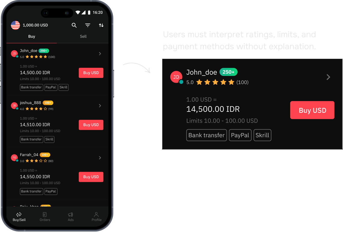
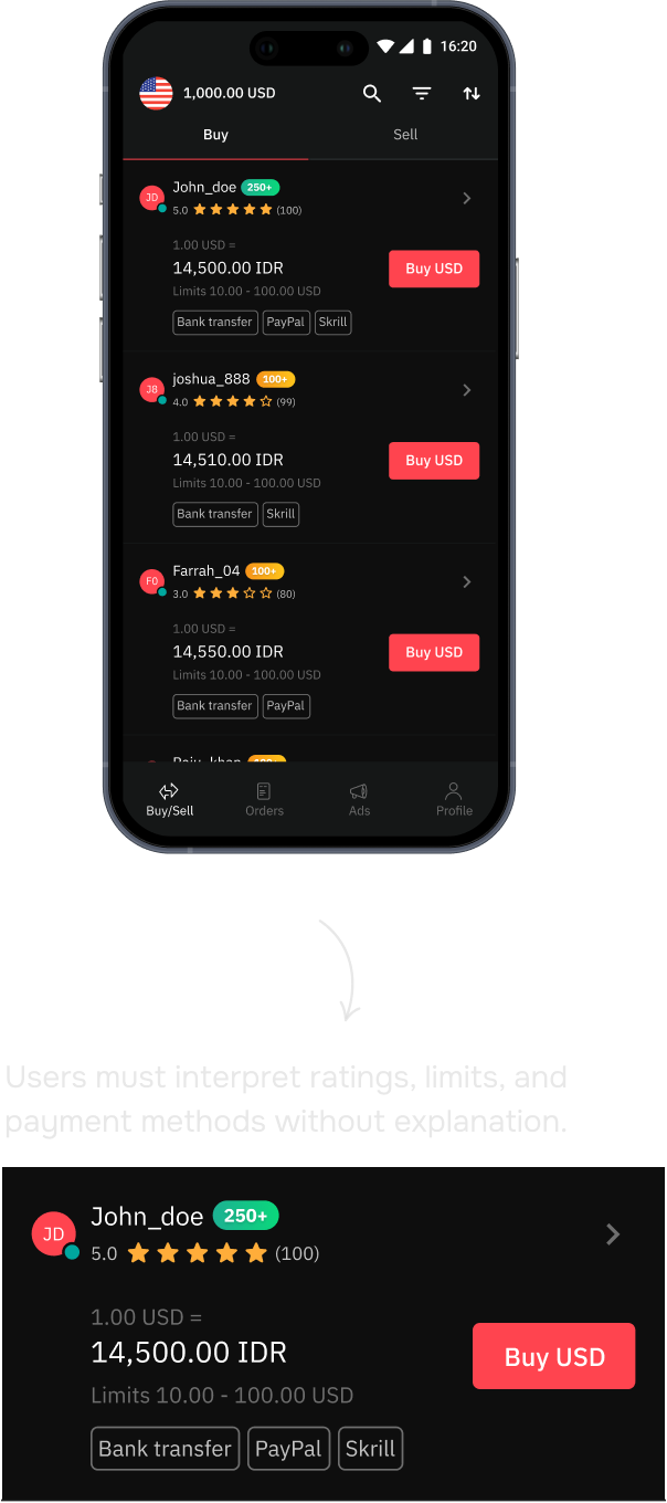
Users browse the listing page to find other people who are interested in buying or selling
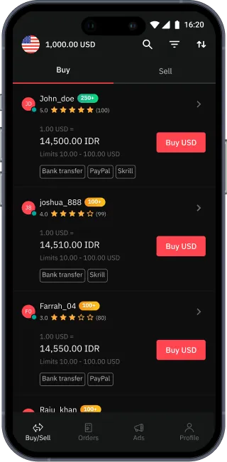

They confirm the amount and details of the transaction with the counterparty.
After user has done their part, they wait for the counterparty to do the same.
Users browse the listing page to find other people who are interested in buying or selling
They confirm the amount and details of the transaction with the counterparty.
After user has done their part, they wait for the counterparty to do the same.
The general flow for a Deriv P2P User
The Problems
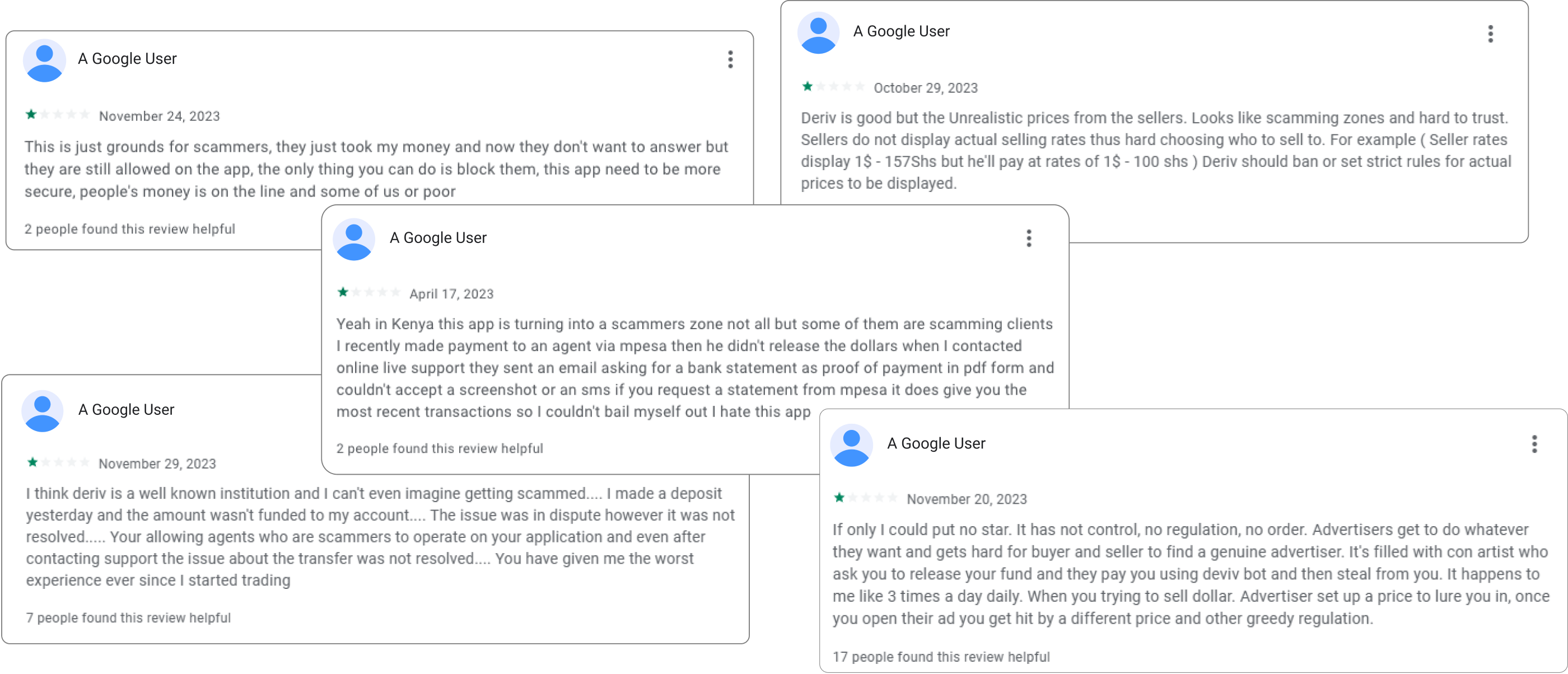
High Scam Risks due to Gaps in User Awareness
The P2P flow unintentionally created moments where users felt a false sense of security, particularly when presented with payment proofs that appeared legitimate at a glance. In the absence of clear guidance, users often proceeded without double-checking critical details. This misalignment between user perception and system safeguards increased scam exposure and eroded trust in the platform.
User reviews on Google Playstore
Through an in-depth evaluation of the app’s user journey, I uncovered several major pain points in the experience.
Lack of guide and onboarding for new users
No onboarding, guidance or explanation on how Deriv P2P buy/sell process works when user first enter the app.
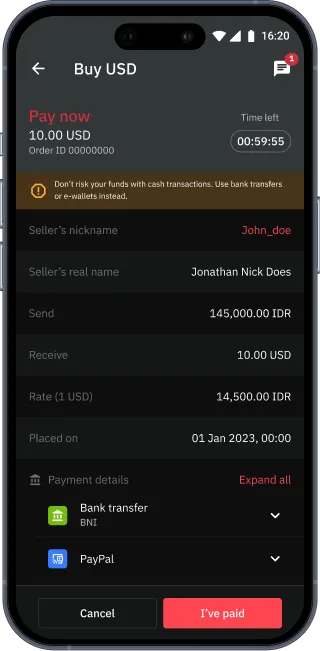
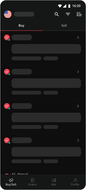
Confirming payments without clear verification
The confirmation screen prompts users to finalize a transaction without offering sufficient cues or guidance to verify actual fund receipt.

.png)
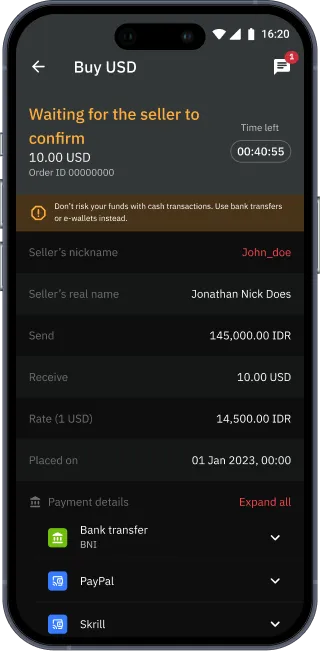
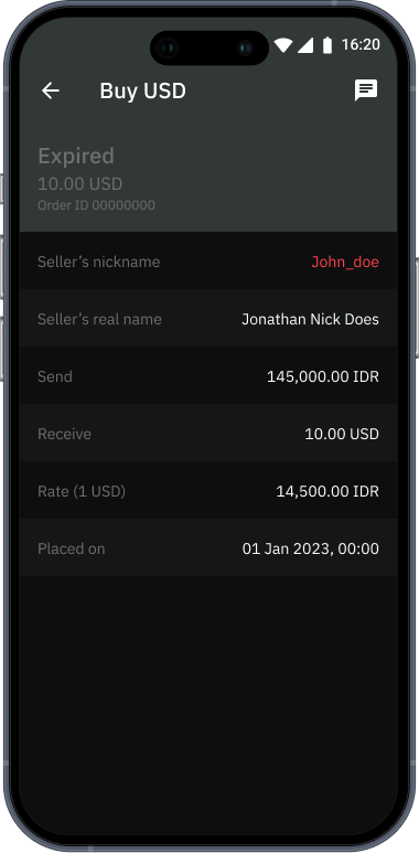
Limited action on expired orders
When a counterparty claims payment was not received and the timer expires, the order status changes to expired.
.png)
Users are unable to take further action on this screen
Users must contact customer support via email to submit a complaint.
The Proposal
Improving the User Experience and Transaction Security
In order to address the key pain points in the user flow starting from the market page, several major features were highlighted that focuses on giving users clearer guidance, stronger safeguards, and actionable next steps to help raise awareness and preventing loss from scams as well as improving overall experience for the users.
Major features for the improvement

The Solution
Redesigning the experience in Deriv P2P
A revamped user journey that feels effortless yet protected. By equipping the users with the right knowledge at the right moment, a transparent paper trail for each transactions, and ensuring fast, accessible supports, user will feel safer and be more resistant to common scam risks.

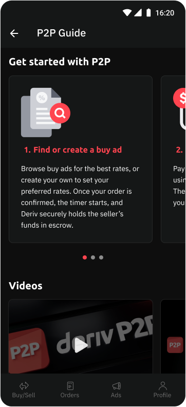
Deriv P2P Guide
The idea: A dedicated guide page on how P2P works
.png)
.png)
A section to explain the main steps of doing a transaction in Deriv P2P
A video guide on how to use Deriv P2P
FAQs section related to using Deriv P2P
The question: Where can users find it?
Iteration 1
.png)
.png)
Guide placed in profile page
In the initial approach, the Deriv P2P Guide was placed within the Profile page as a dedicated help section in order to keep the interface clean and non-intrusive.
However, this created a discoverability issue. Users would only encounter the guide if they intentionally explored the profile settings, which reduced its visibility and impact.

Rejected
Iteration 2

.png)
Guide placed in navbar
The P2P Guide was added directly to the navigation bar to increase visibility and accessibility. This also helps user access it no matter where the user is on the app.
While this made the guide easier to discover, it introduced visual clutter and overcrowded the navigation which in turn weakened the visual hierarchy of core actions within the app.
Rejected
The solution: Guide icon on the relevant page
Guide placed in buy/sell page
The final solution integrates the P2P Guide directly within the Buy/Sell page which is the core trading environment.
This approach balances discoverability with usability, ensuring users can reference key guidance without leaving the relevant environment.

Approved

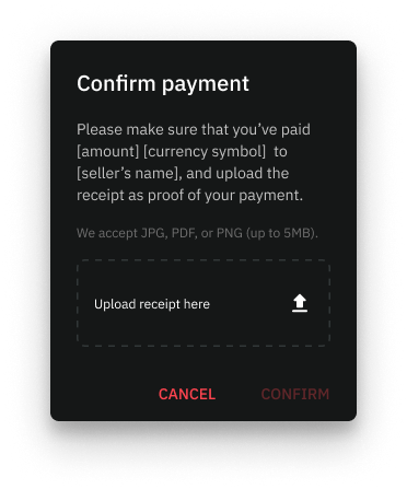
Mandatory Proof of Transactions
The idea: Must upload receipts of payment before confirmation stage
.png)
.png)
Step 1 : Confirm counterparty details
Step 2 : Upload proof of payment
Step 3 : Wait for seller to release funds
The question: How to enforce it?
Iteration 1
.png)
.png)
Modal popup
The first approach introduced the proof upload requirement through a modal popup triggered during payment confirmation.
While this ensured visibility, it abruptly interrupted the transaction flow and some users felt it was too disruptive as if they received a warning message.
Rejected
Iteration 2
.png)
.png)
Separate confirmation screen
Another idea is to introduce a dedicated screen for uploading proof of payment before the final confirmation.
This approach created a clear and structured process. However, this separate page removed important transaction context such as the counterparty details.
Rejected
The solution: Contextual upload prompt
.png)
.png)
Bottom sheet
The final solution uses a bottom sheet triggered at the point of confirmation.
This approach maintains contextual relevance without fully disrupting the transaction flow. The bottom sheet provides clarity, focus, and sufficient emphasis balancing usability with security enforcement.
Approved

Dispute Flow Revamp
The idea: User can raise a dispute within the app
.png)
.png)
.png)
Step 1 : Tap on ‘Complain’ whenever an order is not completed
Step 2 : Select complaint type. User can talk to Support directly via livechat if needed.
Step 3 : Support will be informed and will contact users within 12 hours to resolve it.
The question: How can users track it?
Iteration 1
.png)
.png)
Status Chips Indicator
This approach introduced status chips (e.g., Awaiting Document Submission, CS Review, Resolved) to provide quick visibility into the current dispute status.
While it improved clarity, the chips only reflected the current status without showing overall progress. Users felt anxious due to the uncertainty.
Rejected
The solution: Show the steps and which step is the user currently on
.png)
.png)
Step Progress Tracker
The final solution implemented a structured step progress tracker outlining each stage of the dispute process.
This approach provided clear visibility into past, current, and upcoming stages, offering users a stronger sense of control and transparency during a high-stress scenario.
Approved
The Impacts
How the Redesign Strengthened Trust
The redesign focused on turning moments of uncertainty into moments of clarity. By embedding guidance within the trading flow, enforcing structured verification, and introducing transparent dispute tracking, users gained better visibility and control during high-risk interactions. This in turn strengthen the trust and confidence of Deriv P2P users.
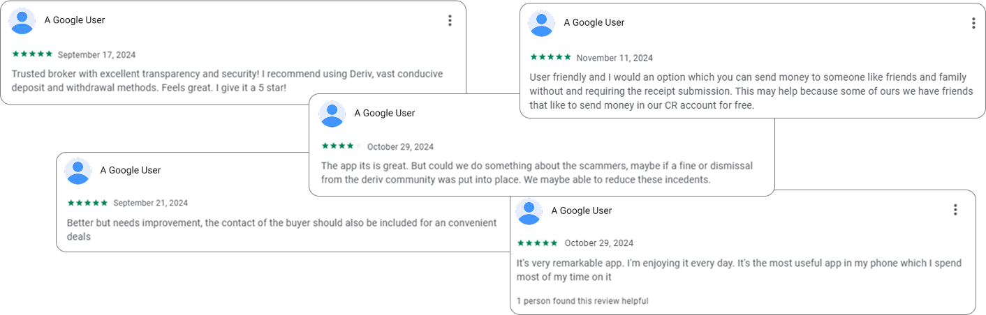
Google Playstore feedbacks
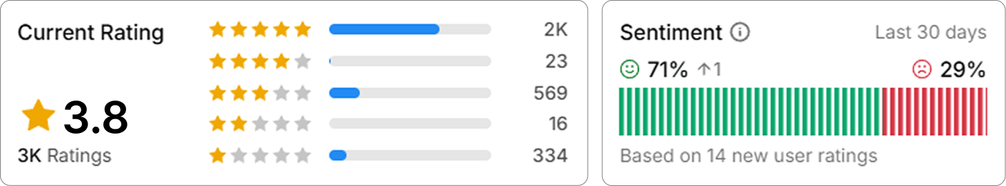

15% increase in App Rating
App rating on Google PlayStore improved from 3.3 to 3.8

71% happy users
Users have higher satisfaction and stronger trust in the app

50% faster dispute resolution time
Disputes can immediately be reviewed and resolved without emails
The Takeaways
Designing for Trust and Efficiency
This project taught me how thoughtful UX design can directly influence both user confidence and trust. By creating a transparent and clear process, users felt reassured and more secure in their Deriv P2P experience. It demonstrates how empathetic, user-centered design can build trust while delivering measurable, real-world impact.
What I've learned:
- Designing for trust is as important as designing for usability since clear, transparent processes reassure users and build confidence in the platform.
- Small workflow changes can have a big impact. By introducing in-app proof submissions, dispute resolutions time are also significantly improved.
- Empathy drives effective UX decisions. Understanding both user and support team needs ensures solutions that benefit all stakeholders.

